Enjoy free worldwide delivery on all orders over £250
SHOP THE AUTUMN COLLECTION
SHOP ALL ACCESSORIES
CREATIVE DIRECTOR
HISTORY
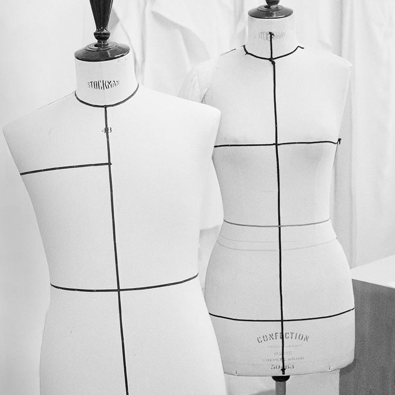
ATELIER
Enjoy free worldwide delivery on all orders over £250 and complimentary returns
Estimated delivery 3-5 business days
Shipping, taxes, and discount codes are calculated at checkout
Your bag is empty
July 2026
June 2026
April 2026
March 2026
February 2026
January 2026
December 2025
October 2025
March 2025
Subscribe to our newsletter.
Please select a shipping country from our available locations.
Shop from the country of your choice. Remember that we can only ship your order to addresses located in the chosen country.